FROM BLANK CANVAS TO BRAND IDENTITY.
Overcoming sterotypical boundaries.
PROJECT BRIEF.
01.
PROJECT TYPE.
OUR CONTRIBUTION.
Logo Design
Brand Colour Scheme
Website Design
PDF Document Creation
Brand Narrative Development
Non-Profit Organisation
CHALLENGES.
02.

OVERCOMING
STEREOTYPICAL BOUNDARIES.
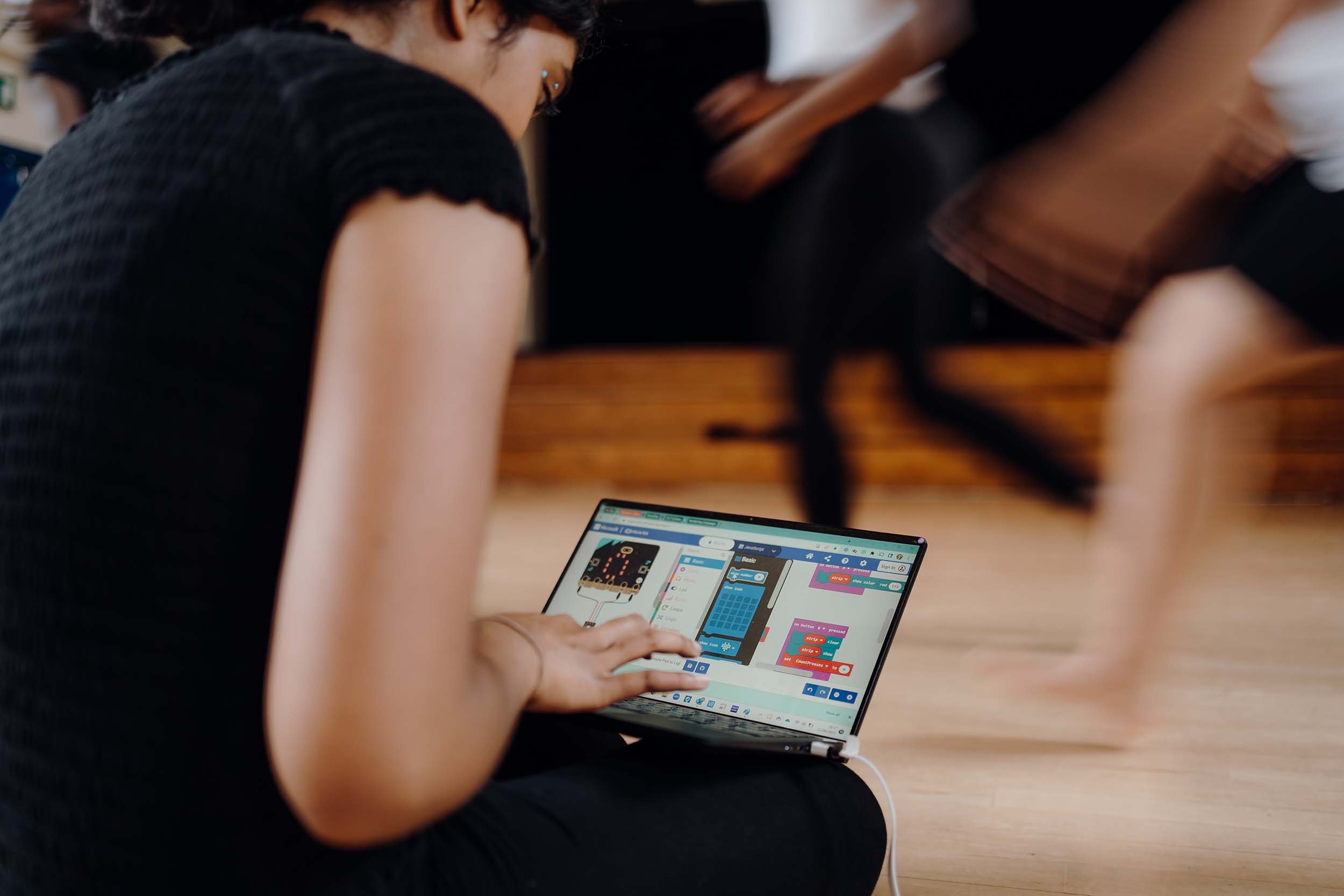
MOVE AND CODE, an innovative initiative aimed at empowering young female and non-binary individuals through creative computing and movement, faced several branding and design challenges:
/01
Developing a logo and colour palette that reflects the energy and educational focus of MOVE AND CODE, while being appealing to both young participants and adult stakeholders.
/02
Crafting a website that not only serves as an informative platform but also captures the essence of creativity and movement inherent to the programme.
/03
Achieving a design that balances simplicity and informativeness, tailored to appeal to both young people and their educators or funders.
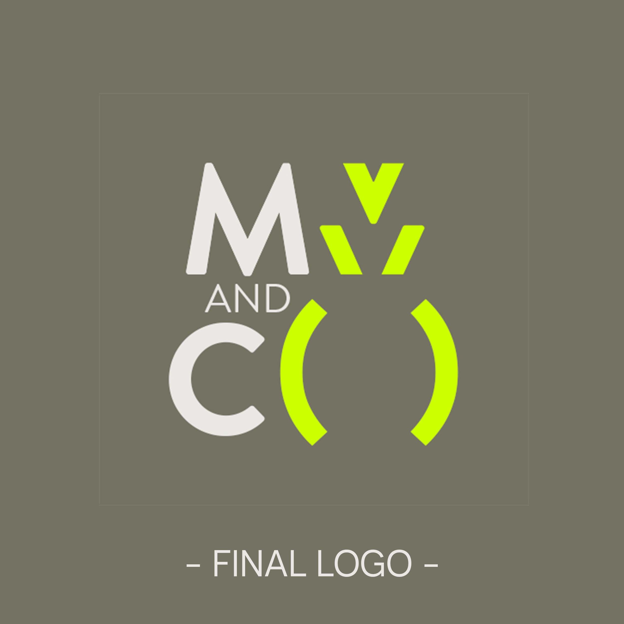
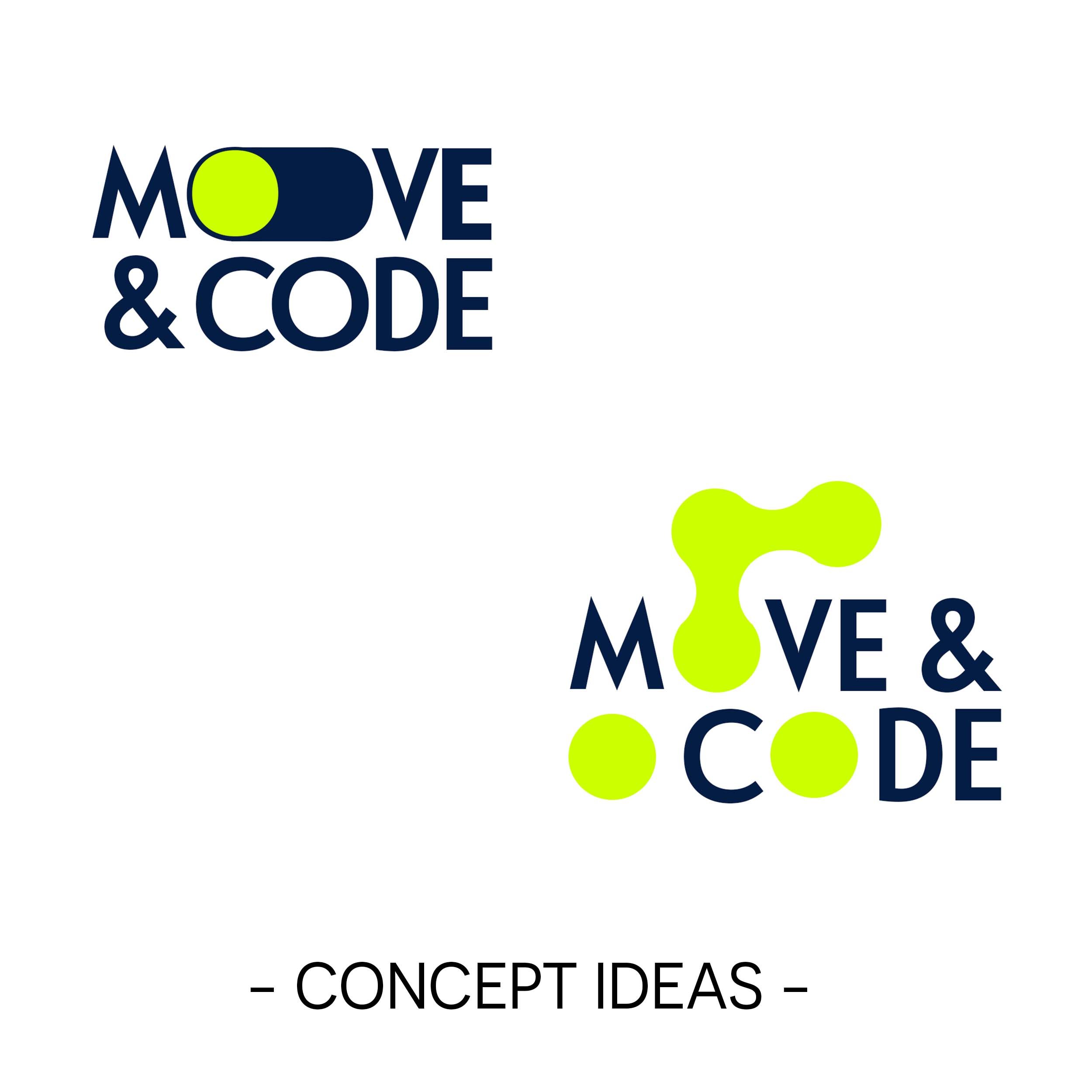
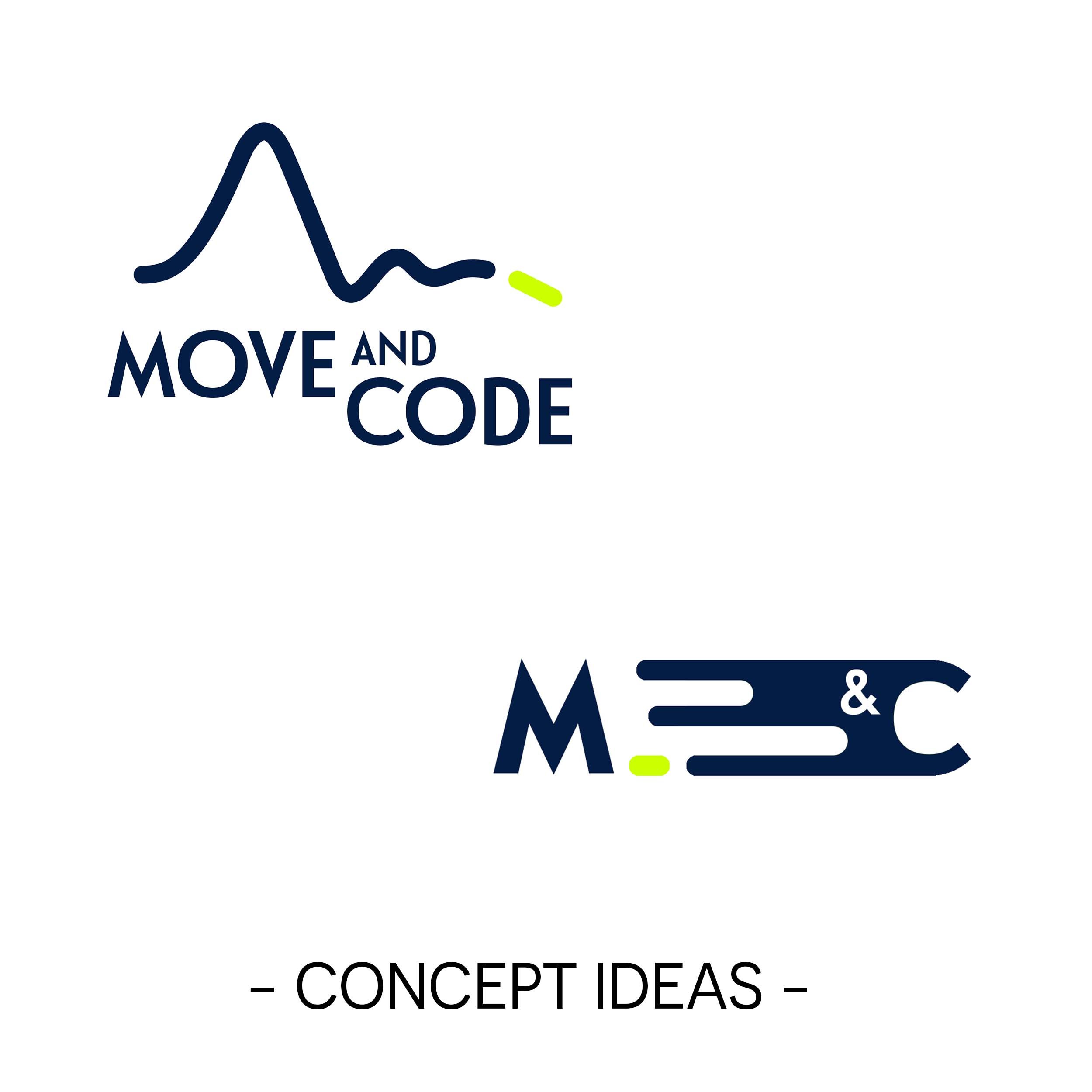
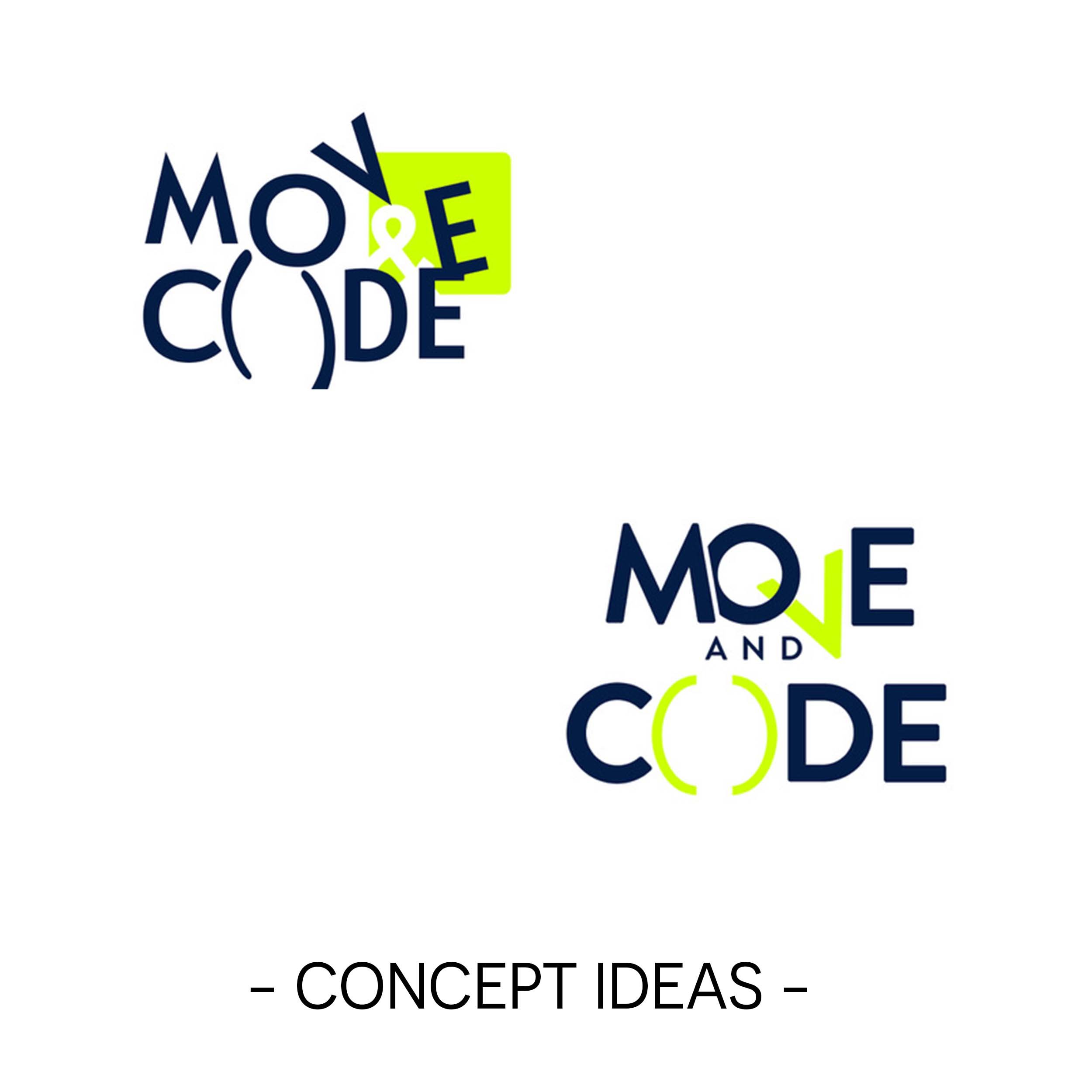
CRAFTING CLARITY: THE EVOLUTION OF A NEW LOGO.
03.
In creating MOVE AND CODE's logo, a meticulous journey of distillation was undertaken, beginning with a broad spectrum of draft logos inspired by their diverse mood board.
Through a collaborative process of exploration and refinement, extraneous elements were gradually stripped away, resulting in a clear, simple design that perfectly encapsulates their vision and values.
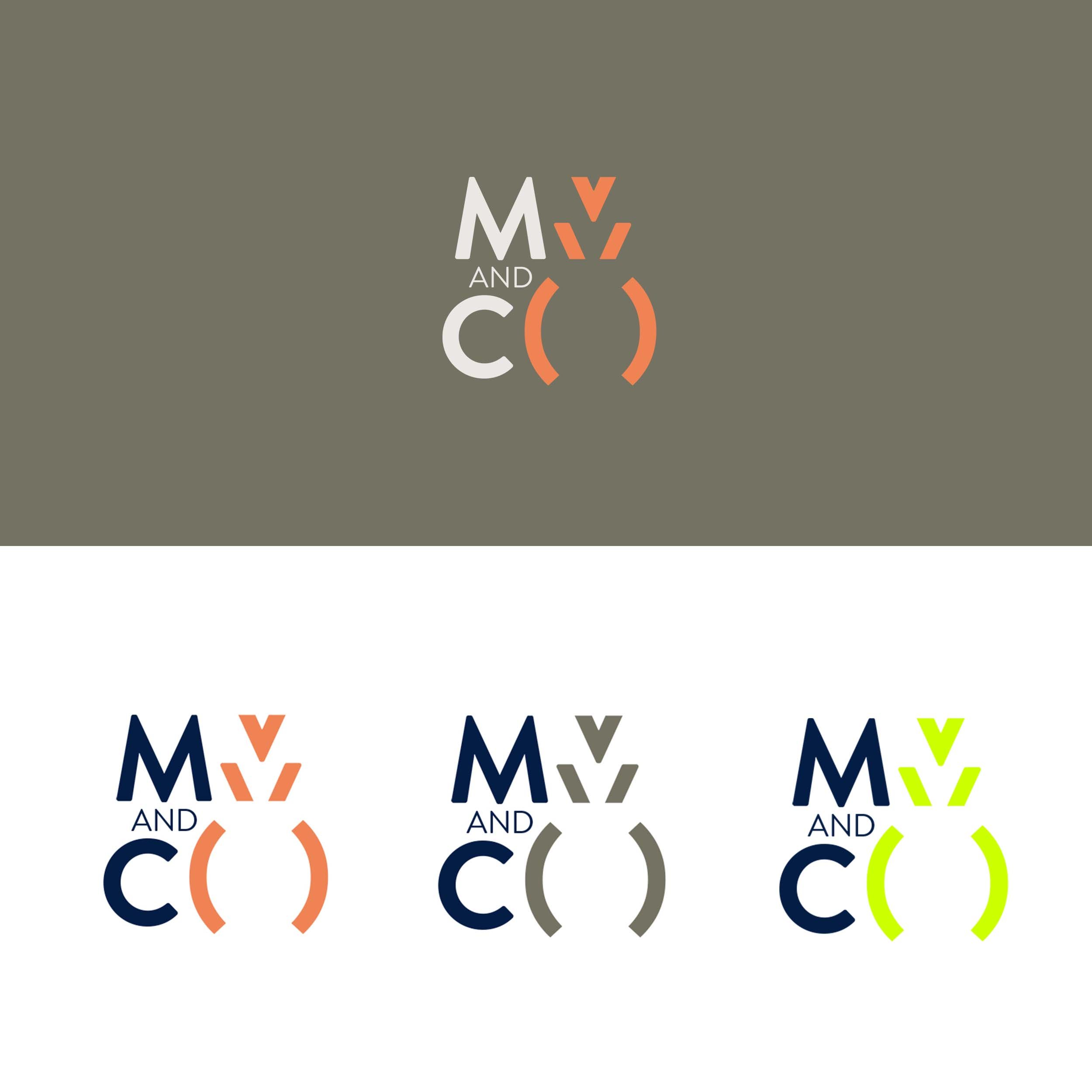
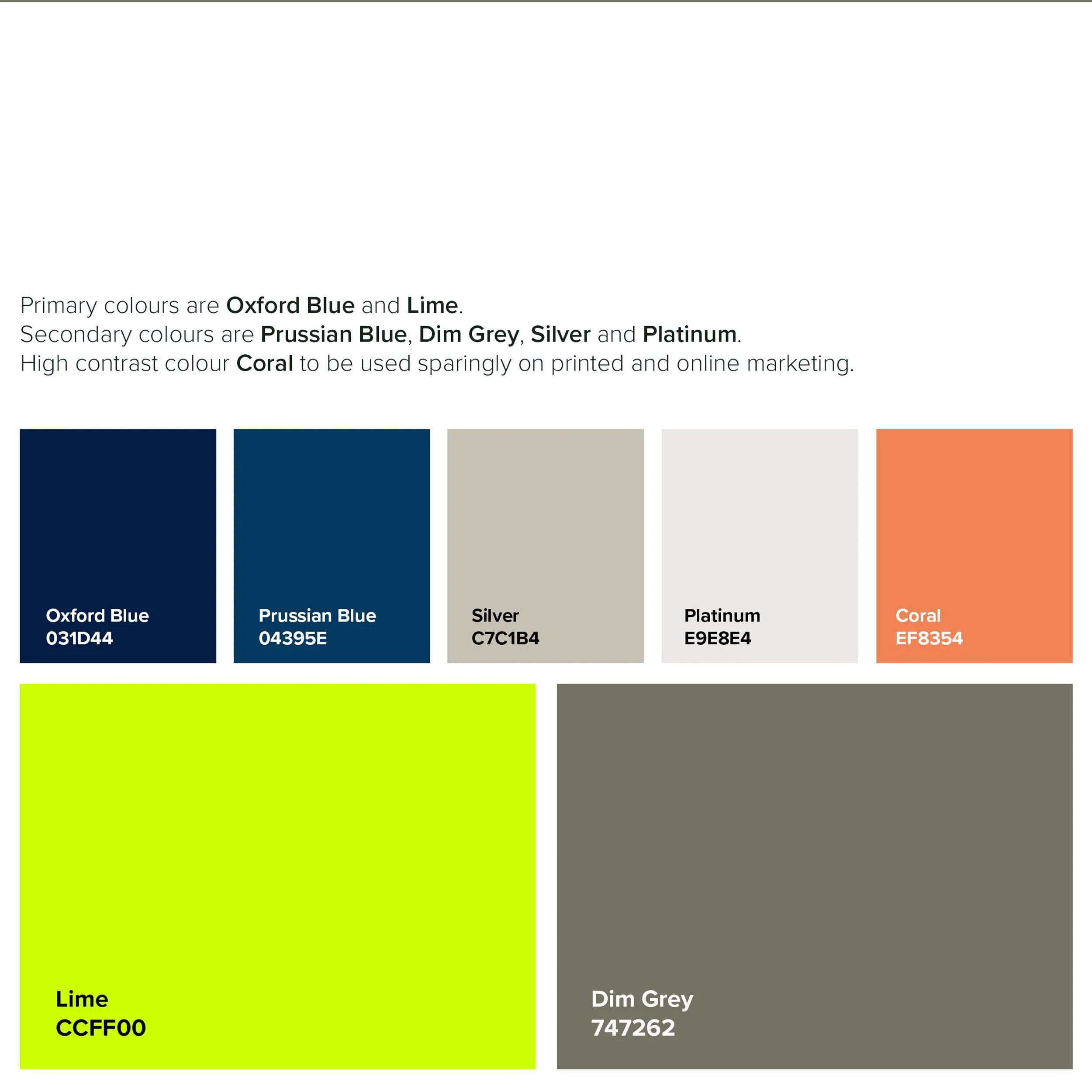
VIBRANCY MEETS VERSATILITY.
04.
For the colour palette, a fresh, creative exploration was initiated to craft a youthful and engaging scheme that deliberately avoids stereotypical associations.
This process involved iteratively selecting vibrant, inclusive colours that resonate with the initiative's dynamic spirit and appeal to its diverse audience without relying on clichéd hues.
VISUAL SIMPLICITY WITH INFORMATIVE DEPTH.
05.
The approach to the website was designed to enhance user experience by incorporating interactive elements and motion that reflect the programme's dynamic nature. A novel narrative device—a single dot—was introduced.
This dot, subtly integrated within a code-inspired landscape without being overly literal, acts as a captivating narrator throughout the site. Its movement across the page—growing, shrinking, forming shapes, and creating connections—adds depth to the storytelling. The design is not only intuitive but also richly engaging, featuring layered navigation that enhances both engagement and accessibility.

BALANCED DESIGN APPROACH.
06.
The final design strikes a perfect balance between visual simplicity and informative content, tailored to resonate with both the young audience and the adult decision-makers.
THE CLIENT SAYS.
07.
“John did a fantastic job working with Su and I to develop our branding and logo and put together a whole new website.
I had underestimated the work it takes to do this but John made it feel easy, broke down the steps into clear processes, was a great listener and wonderful creative collaborator.
We are so pleased with the results and are very excited to share it far and wide! Thank you John!”
Rebecca Evans.
Co-Director of MOVE AND CODE.
THE OUTCOME.
08.
INNOVATIVE IDENTITY:
CHAMPIONING GIRLS AND NON-BINARY CODERS.
The outcome of the design journey for MOVE AND CODE stands as a testament to the successful fusion of the two Directors' visions into a cohesive, stereotype-defying brand identity.
This meticulously crafted design harmonizes diverse ideas while boldly addressing the initiative's core mission: to inspire and empower girls and non-binary individuals in the world of coding.
By avoiding clichéd representations and focusing on inclusivity, the new brand design resonates deeply with its audience, setting a new standard for how educational programs can visually communicate their commitment to diversity and innovation in the tech space.
Inspired by MOVE AND CODE’s journey?
Let's collaborate to craft a brand experience that authentically represents your story and resonates with your audience.