THE CLEARCUT REVAMP.
Embracing a fresh perspective.
PROJECT BRIEF.
01.
PROJECT TYPE.
OUR CONTRIBUTION.
Brand Refresh
Website Redesign
Branding Guide
Content Writing
Producers
CHALLENGES.
02.

CLEARCUT, A BEACON IN THE DANCE COMMUNITY, SOUGHT TO
REVITALISE ITS BRAND IDENTITY.
Have you ever felt your brand's identity no longer reflects your evolving vision?
This was the challenge presented with the exciting brief.
/01
I aimed to weave modernity into their logo, colour palette, content style, and website, mirroring the vibrant energy and professionalism that Clearcut stands for.
/02
The goal was to weave modernity into the logo, colour palette, content style, and website, reflecting the vibrant energy and professionalism that Clearcut represents.
/03
Harmonise the authenticity of their legacy with a fresh, modern charisma.
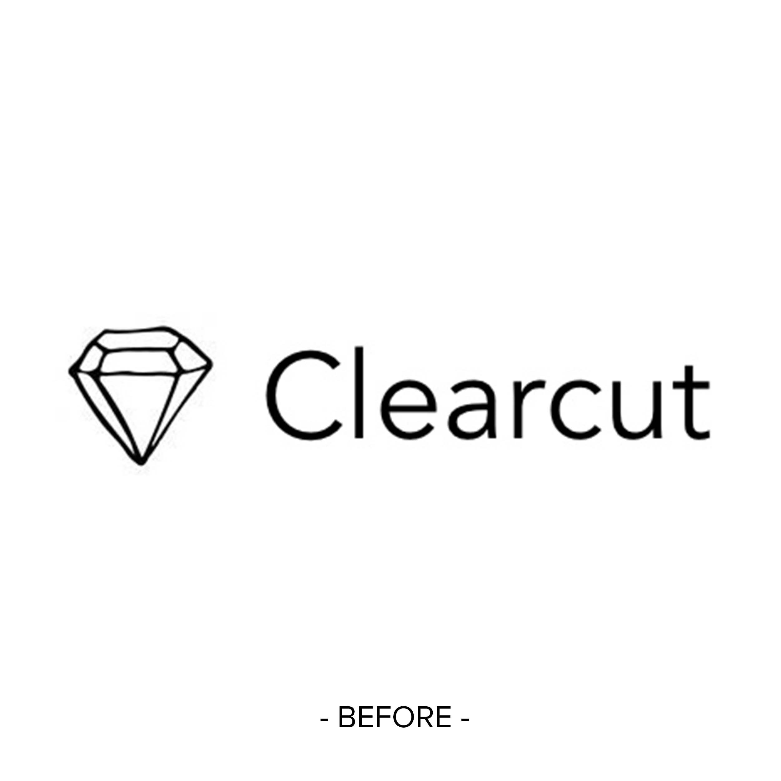
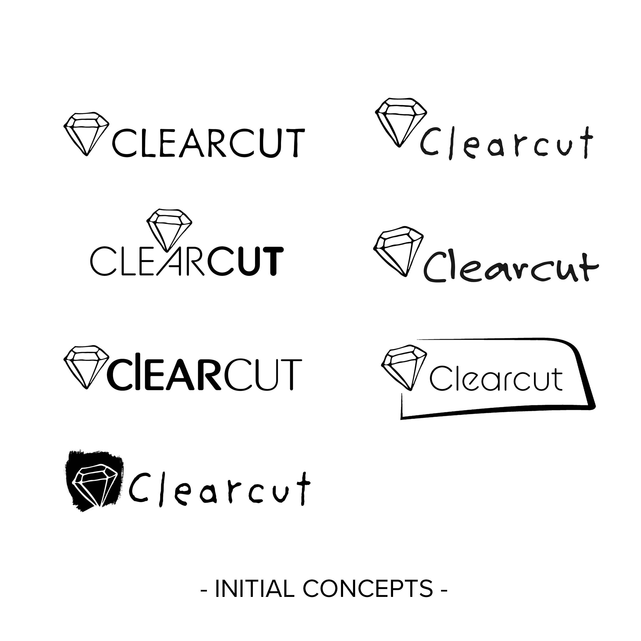
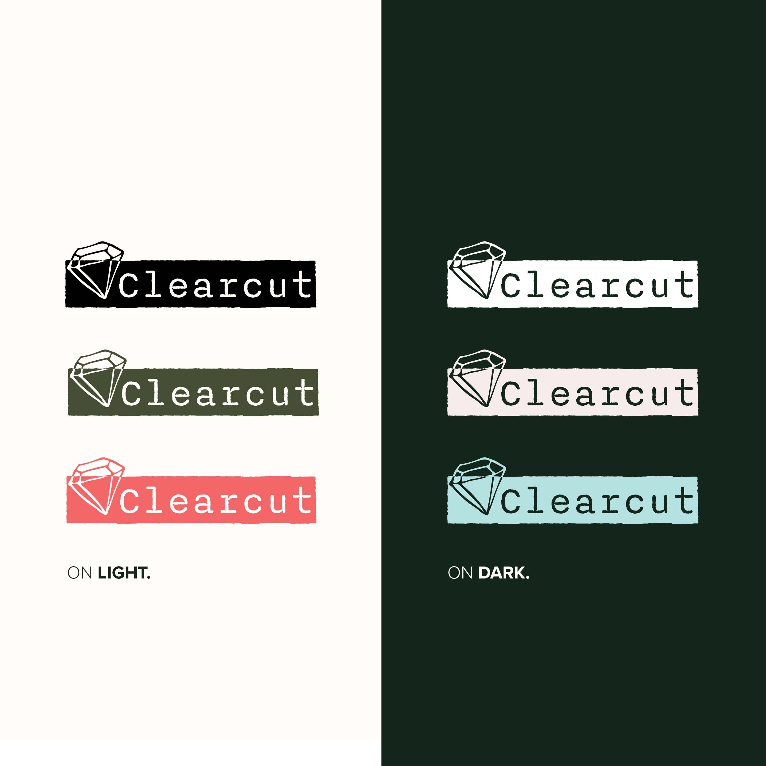
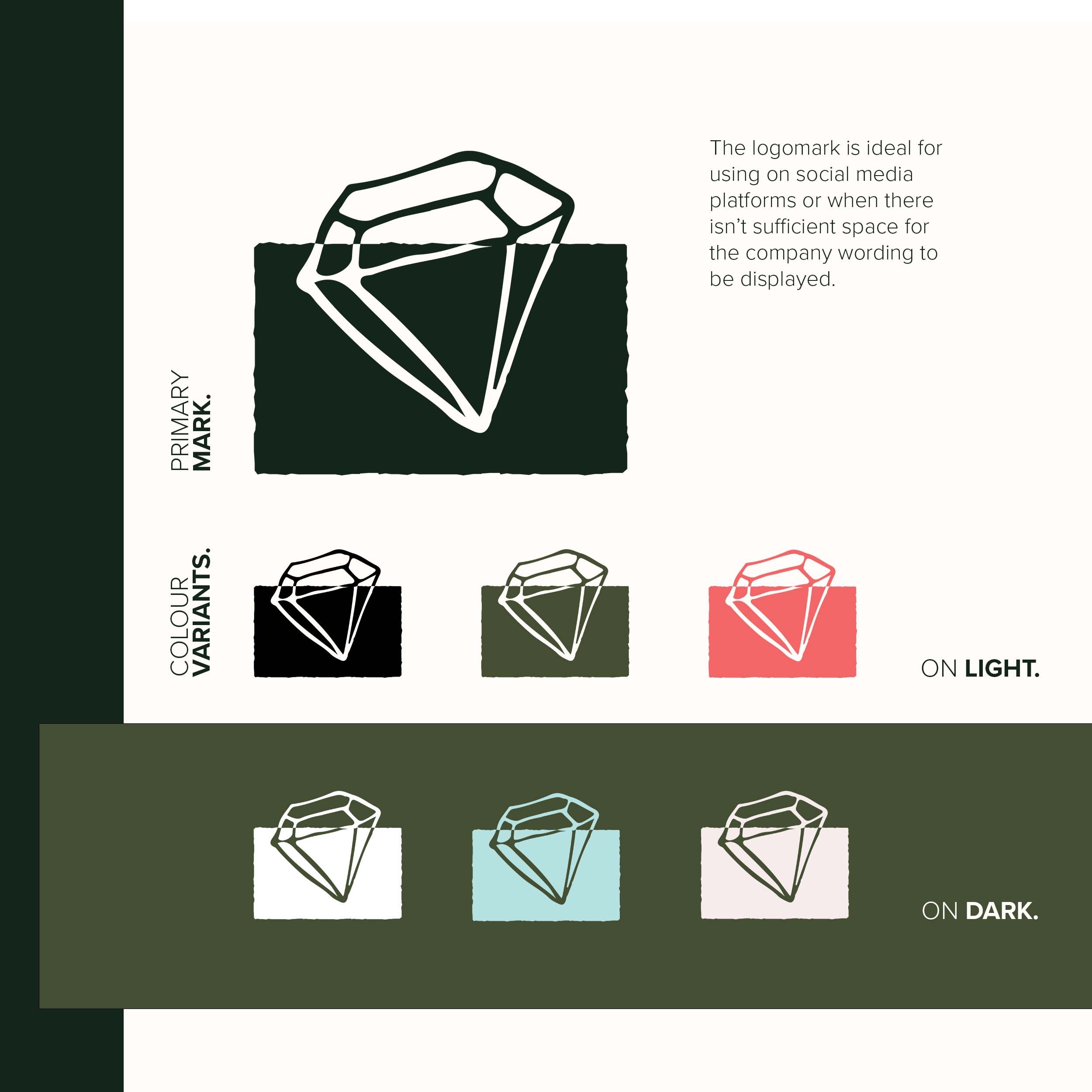
REVIVING THE LOGO.
03.
The crystal logo, symbolising clarity and multifaceted creativity, needed a transformation.
It was reimagined to blend its symbolic heritage with a sleek, contemporary design.
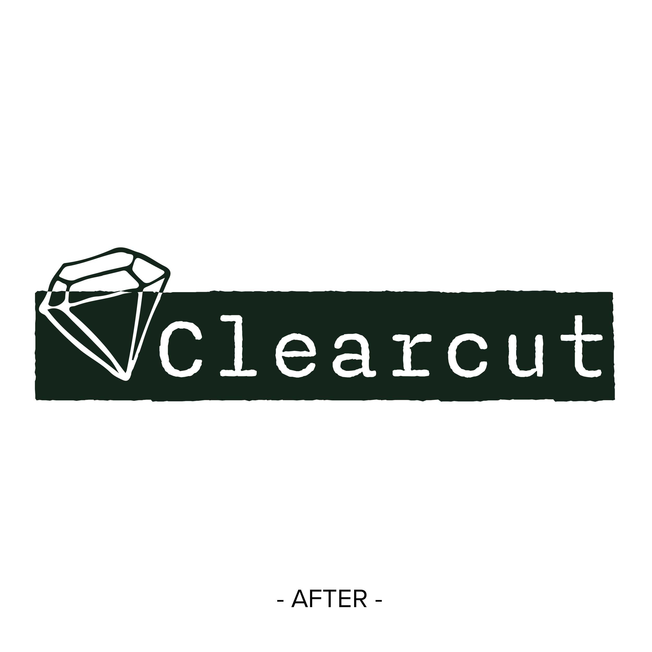
COLOUR PALETTE REIMAGINED.
04.
The traditional palette was elevated to a modern spectrum, reflecting Clearcut's vibrant personality.

NARRATING THROUGH CONTENT.
05.
The challenge was to create a content style that was both celebratory and subtly refined.
The solution was to provide fun exercises and draft ideas to help Kyla and Vicky find a tone that narrates their work with an air of professional elegance.

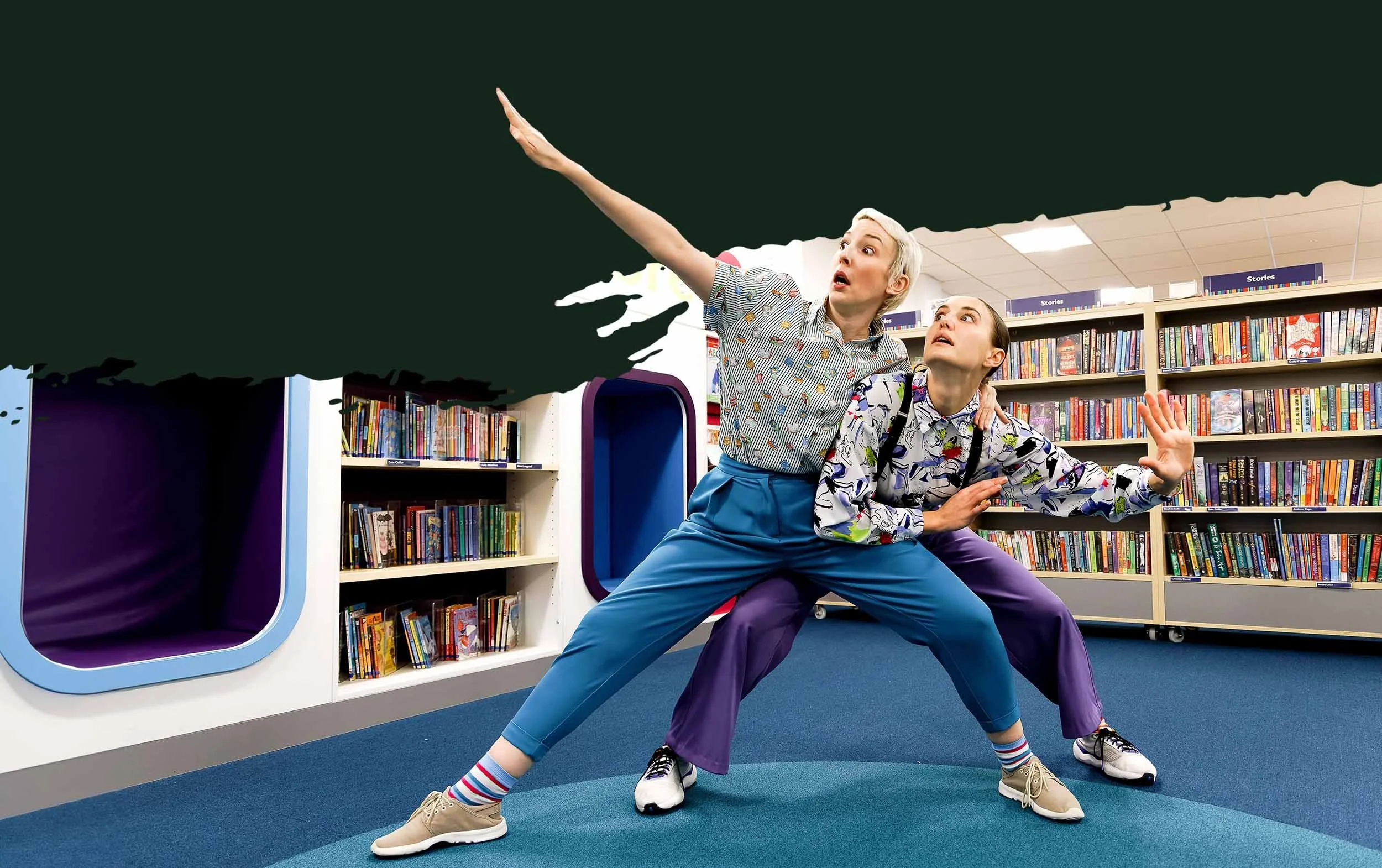
REDEFINING THE DIGITAL SPACE.
06.
My goal was a significant uplift in the website's visual identity.
The outcome is an intuitive, layered website design that enhances user experience and engagement.
THE CLIENT SAYS.
07.

‘John at NOCTURN Designs recently redesigned our website and it was an absolute pleasure to work with him.
The process unlocked a new brand identity for our company, and John guided us knowledgeably and skilfully through the design process to get the look and feel of the site that was elevated in every way. John spent time to connect with us to ensure the site reflected our needs perfectly.
He is also immensely patient with busy people providing the right amount of reminders, action lists and check ins to get the site over the line.
Would 100% recommend.’
Vicky, Clearcut
08.
THE OUTCOME.
BEYOND A REDESIGN:
THE LASTING IMPACT ON CLEARCUT.
This comprehensive brand makeover has significantly enhanced Clearcut's image, making it more relatable and appealing to a diverse audience.
The new visual and content identity has deepened community ties and sparked new interest.
Are you inspired to begin your brand's journey of transformation?
Let's create a brand experience that authentically represents your story and resonates deeply with your audience.